Using Natural Language Processing to visualise Uncertainty in News Content

Exploring Policy Uncertainty in Malaysia, from the Eyes of a Physicist
As a physics geek, I have always been intrigued by quantitative analysis used in government. Whilst I agree that statistics and numbers are incapable of telling the whole story, it is still interesting to apply math and computer science in creative ways that might help steer policy decisions.
This post will outline the importance of quantifying and defining the public’s uncertainty concerning their government and policies. I’ll also describe a straightforward machine-learning solution I designed a few years ago. As a first step towards visualising policy uncertainty, I wrote a simple piece of code.
The role of uncertainty in public policy
In August of 2021, Muhyiddin Yassin resigned from his role as the prime minister of Malaysia. The Malaysian people elected Pakatan Harapan elected into power in May 2018. The regime change ushered Malaysia and its people, again, into an era of uncertainty. What was the fate of its leadership as well as its policies, both social and political? In these volatile times, it seems that understanding and managing the public’s uncertainty concerning its leadership is becoming increasingly important.
Malaysian news reporters and pundits often use the word ‘uncertainty in the wake of a significant policy change, but little work or analysis is done on their part to quantify the magnitude of uncertainty at any given period. Furthermore, there is even less work to compare current uncertainty to periods of previous uncertainty. There is already complicated philosophical debate on what uncertainty even means. We also rarely hear about the causes behind why the citizens feel uncertain. The public is anxious about a new government in the wake of Malaysia’s recent political changes. But why?
Are people unsure about the direction of the general economy?
Are they worried about the fate of their children?
Are they unsure about the future handling of COVID-19 in Malaysia?
There are several practical steps a more active government might wish to take once having a greater understanding of policy uncertainty. They might identify ‘high priority issues’, which are the most pressing and, they may wish to reassure the public on these exact issues. They might also provide assurances to sources of foreign direct investment which are concerned about particularly uncertain topics.
My first dip into policy as a math undergrad, and some academic inspiration
It was the summer of 2017, and I had just finished an exhausting first year as a math undergrad at Cambridge. I knew I wanted to do something in government, but I didn’t know how to apply my particular skillset. People I knew in government were economists, but I focused on physical applied mathematics in my first year, so it wasn’t immediately clear how my skills would be helpful. Luckily, I had an opportunity to do some research in the monetary policy department of the Malaysian Central Bank.
I knew how to do some basic coding and had a repertoire of first-year undergrad math to help me figure out what I wanted to do. In the end, my supervisor and I decided on doing a rough project on ways to quantify public policy uncertainty in the spirit of what was outlined in Baker, Bloom and Davis (2016)¹. In this paper, they developed an index of economic policy uncertainty for the United States and examined its evolution since 1985. The authors count articles in 10 leading U.S. newspapers that contain the following trio of terms: “economic” or “economy”; “uncertain” or “uncertainty”; and one or more of “Congress,” “deficit,” “Federal Reserve,” “legislation,” “regulation,” or “White House”, and then normalise the counts to take into account varying numbers of articles released on the whole in general.
The use of newspaper articles to quantify policy uncertainty sounded like a good place to start. However, there were some modifications that I wanted to make:
I was more concerned about ‘explaining’ policy uncertainty — so my strategy consisted of finding ways to visualise the different subject matter of Malaysian news articles which pertained to policy uncertainty. So, I wanted to find a programmatic way to classify ‘policy uncertainty articles’ and see the different topics which caused uncertainty over time. But, of course, an index is merely a measurement tool. Undoubtedly, the content and story of an index are just as interesting.
I didn’t want to count articles based on search results manually, so I built some python code to automatically scrape news article metadata from a range of Malaysian websites.
The final project itself
Thus, the final project I settled on had a three-step plan which I carried out. First, I was going to count articles published throughout time related to policy uncertainty and then visualise the ‘topics’ that made up the composition of these articles throughout time.
First, I found a way to automatically scrape article meta-data at scale from various Malaysian news websites, using an automated scraping code I wrote in Python. I then had to do some work to obtain just the articles related to policy uncertainty in Malaysia, and filter out junk and clean the dataset — I describe this in the next section, where I follow an approach quite similar to that presented in Baker, Bloom and Davis.
Once I had the dataset of articles relating to policy uncertainty, I then used a simple clustering algorithm as an unsupervised method to classify the different articles into five distinct groups, where each group represents a distinct ‘theme’ of policy uncertainty. The ‘labels’ of each cluster were the first two words closest to the centroid of each cluster. Thus, these labels can be interpreted as the ‘theme’ of each cluster.
The final step was to do some primary aggregation to see the proportion of articles in each cluster throughout time and then plot this in an area plot.
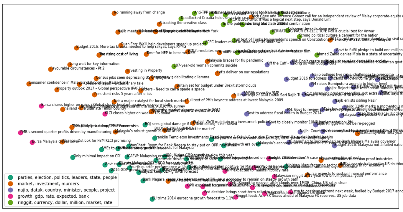
The final result involved a successful scrape of article metadata of around 600 different news articles from 2005 to 2018. I then used k-means clustering on a word matrix to sort these articles into 5 distinct clusters, each of which has labels (the words closest to the middle of the centroid) which are shown in the below plot. As you can see the first result that is interesting is that each of the centroid labels is fairly interpretable, and it is clear what each cluster represents — there was no checking required by me. It appears that k-means clustering selected fairly natural topics (all by itself) as possible categories for policy uncertainty.
The stacked plot below shows the relative weights of these clusters throughout time. The y-axis shows the cumulative proportion of each topic’s prevalence in the whole set of articles that pertain to uncertainty at a given time . If there’s more of a given colour, then a more significant proportion of articles belongs to that category. The x-axis is time. Overall, we see some reasonably unsurprising events — uncertainty around the ringgit formed almost all of the explained uncertainty around 2008. We also see increased uncertainty around former prime minister Najib in the run-up to the 2013 General election. Coming up to the 2018 General Election, there was serious doubt over who would take power, so the ‘election’ category in yellow is more prevalent.
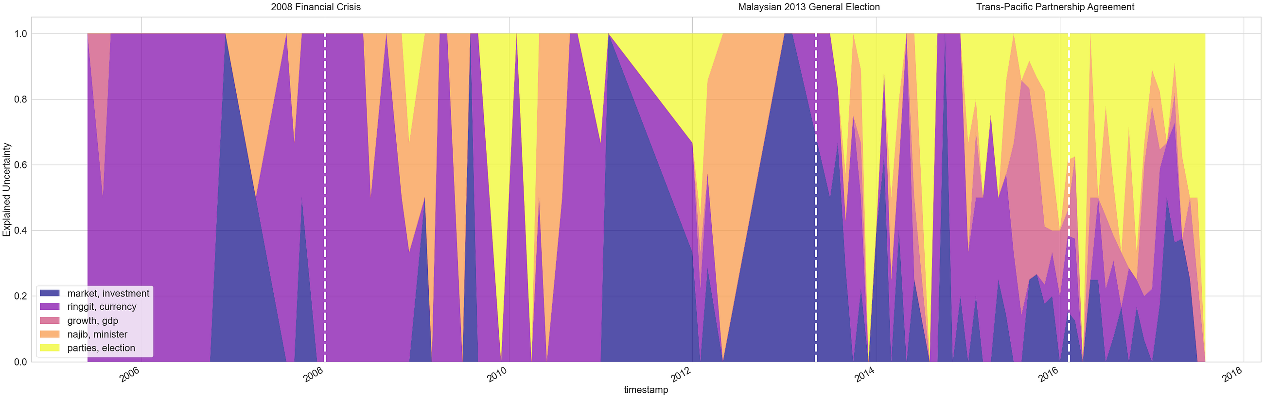
I think this is a rudimentary but perhaps useful start at how one might find a way to visualise public uncertainty. If we were more proactive about collecting data, it might be helpful to for governments and organisations to inform their decision making around visualisations such as the above. I am a big believer in exploiting technology in policy decision making, and this is a novel example of one way it could be done.
This is a methodology is far from perfect. Obviously, there are questions around newspaper bias, the accuracy of the scraping, and whether newspapers accurately capture a nation’s psyche. In addition, there is more work to be done trying to capture the relative ‘magnitude’ of uncertainty throughout time — however this question is difficult to answer without an estimate of the total production rate of Malaysian newspapers at any given period.
Here are some of the rougher notes below on how I constructed this index. If you’re interested in some more of the details, read on.
Constructing the web scraper
First, I selected a range of popular Malaysian websites which I thought would be a good sample of the general Malaysian news ecosystem. I also made sure (from my own heuristics) that my choice of websites were not from overtly opinionated sources — I will not declare the explicit names of these websites on this post.
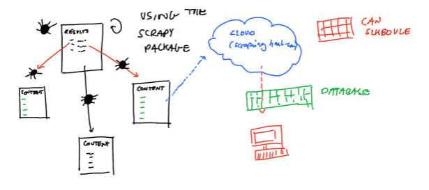
I then used a mix of scrapy, beautifulsoup and the requests package in Python to set up an automated process to scrape the links which were found in the search pages of these websites. If you are new to web scraping, something which makes this job much more manageable is understanding how to select the correct webpage elements using the XPath syntax — there is an excellent guide to XPath selection on this webpage.
I then wrote an automated loop to download the text content associated with each article that appeared in the search through a web service, one can look this up. The diagram here shows the flow:
Filtering out what we want
Even though I only scraped articles that appeared in the search — there was still a lot of junk present in our articles. Spot checking showed that only around 10 per cent of the articles contained content that one could say was related to ‘policy uncertainty’. So I decided to use some simple heuristics to help me choose the articles that mattered. Surprisingly, I managed to get some decent results from following the method outlined in Baker, Bloom and Davis, but I adapted it to this use case.
After scraping all of the articles, I only chose to keep pieces that contained at least one word from each of these lists:
Economy, economics, market
Uncertainty, uncertainties, uncertain
Najib, government, parliament, bnm, BNM
Malaysia, Malaysia, Kuala Lumpur
Clustering the content of the article
Something simple that I tried to help me visualise the content of the selected articles was simple k-means clustering. I converted the documents into a term-frequency, inverse-document frequency matrix and then clustered the documents into 5 clusters. There is a fantastic guide on how to do this by Brandon Rose here. Below, we show an image of the clusters and the composite documents.
This article was initially published at https://www.afiqhatta.com.